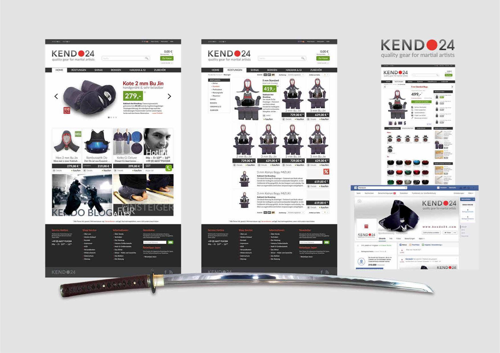
Client • kendo24.com
Design of a „More than Sports“ Brand
The online shop for the Japanese National Sport Kendo needed a completely new brand identity and design system to stand up to the growing competition on the online-market.
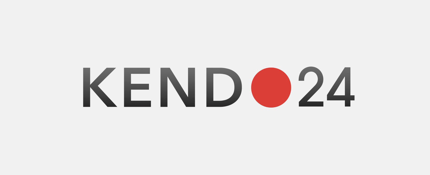
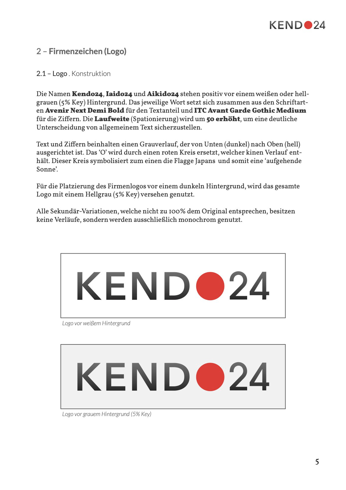
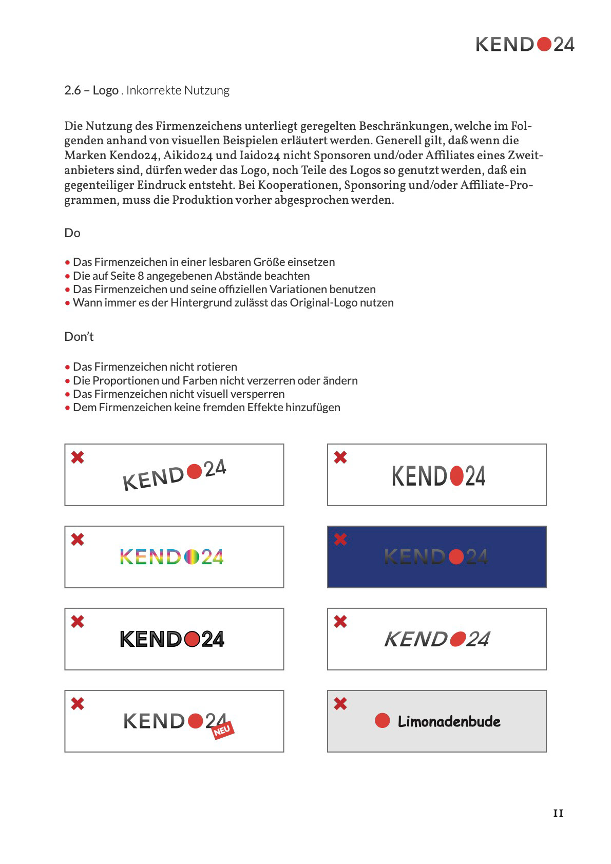
The logo, reduced to essential elements, conveys the origin and philosophy of Japan's national sport
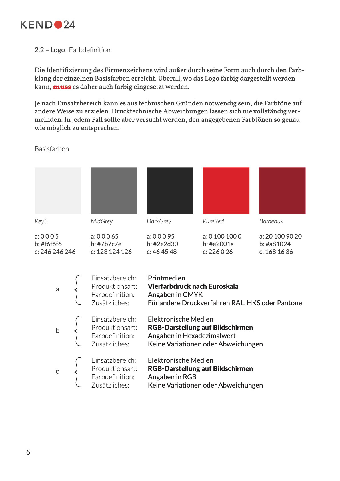
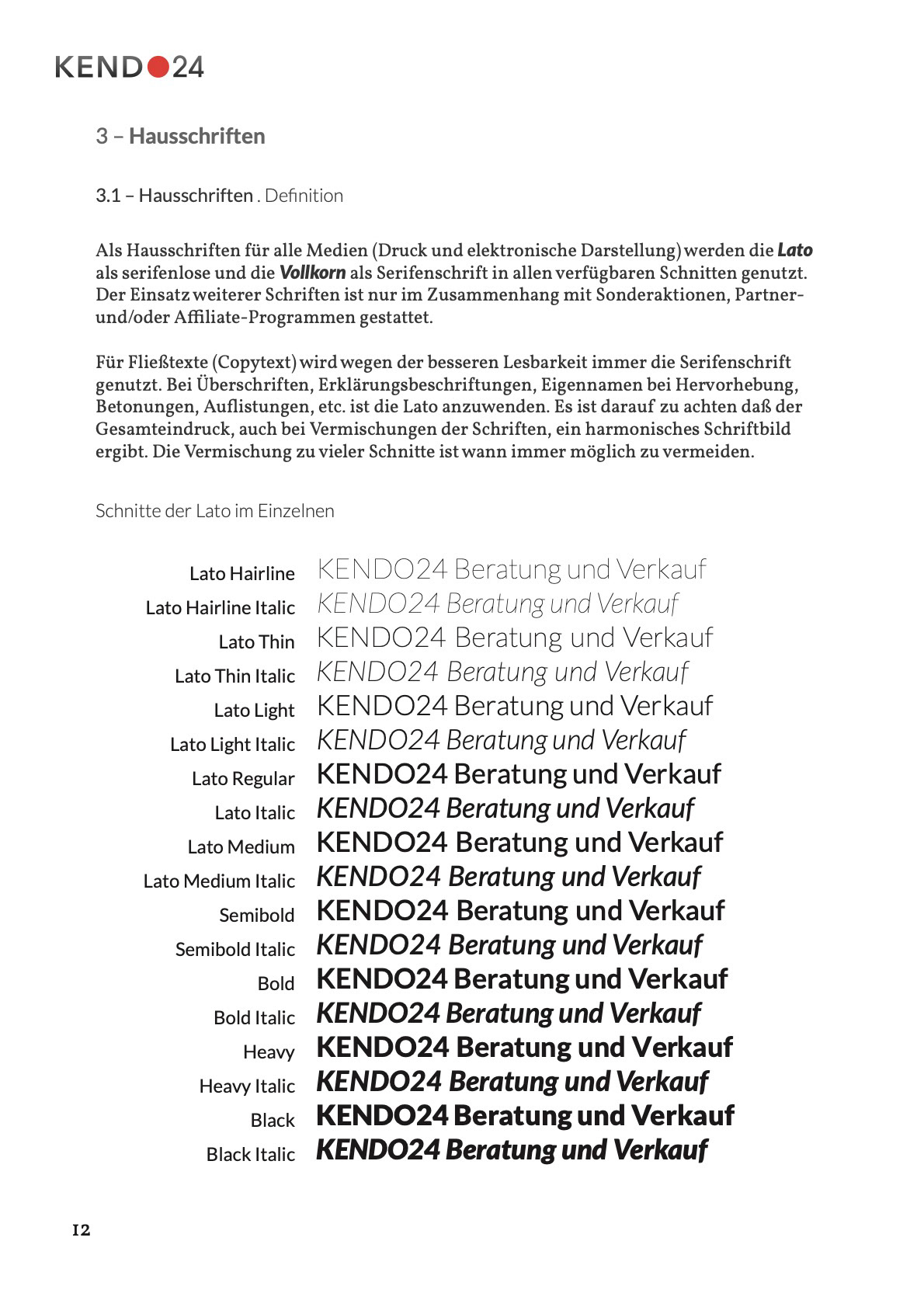
The logo construction was overhauled, a simpler form and colour language was established in an expandable design system, and the typography was systematically defined in terms of goal and form of use.
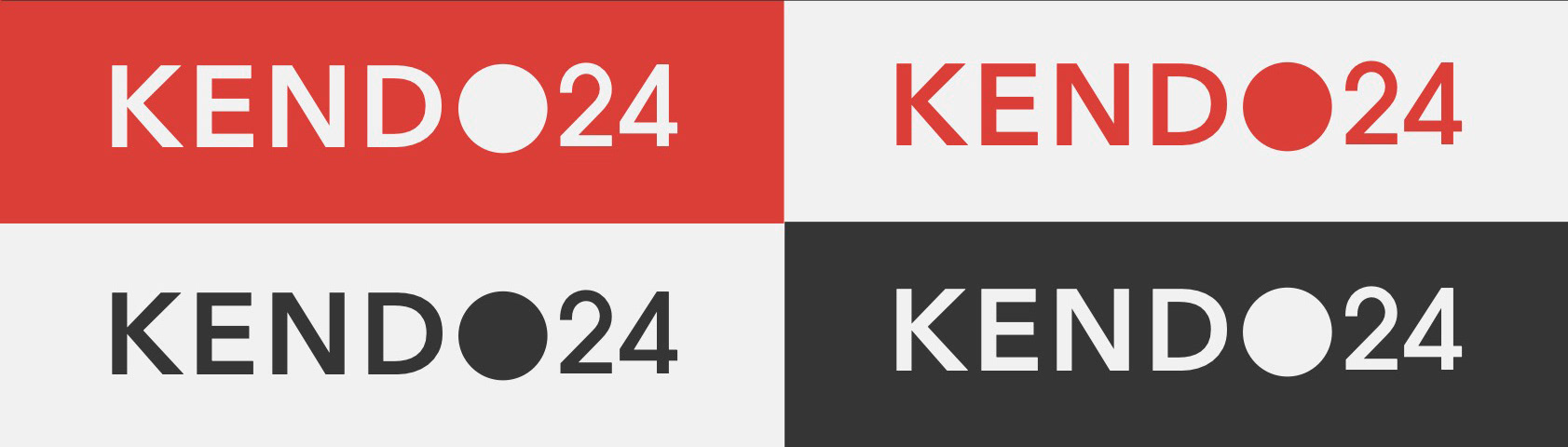
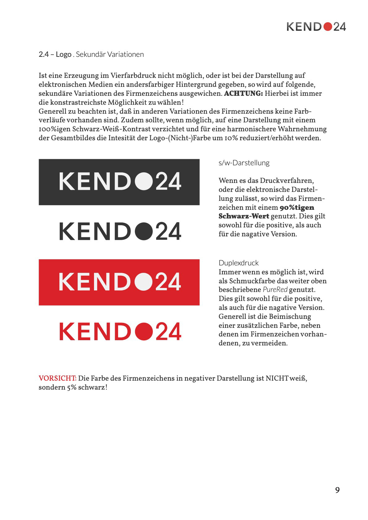
The logo and color system was also designed for monochrome use
During the design process, the sub-brands Iaido24, Aikido24 as well as the premium brand Bu-Jin had to be considered so that an affiliation to the umbrella brand is clearly recognisable. The design principles were transferred to them and a modified adaptation was made for Bu-Jin to illustrate its special position in the brand architecture.

The sub-brands as a harmonious interplay of the brand architecture
Corporate Design is as part of the CX
The user experience was improved by means of clearly recognizable options for interaction, a better user orientation in the site structure and information architecture, as well as a radically simplified checkout process.
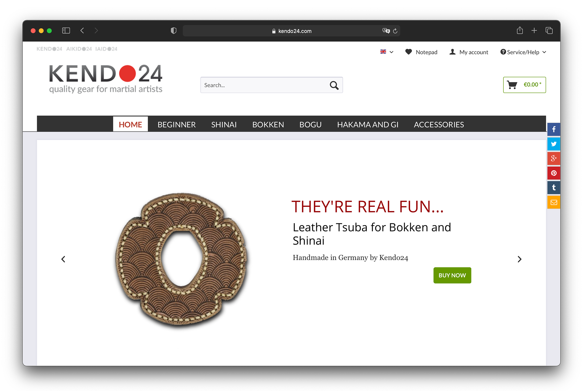
Joy of Use by Information
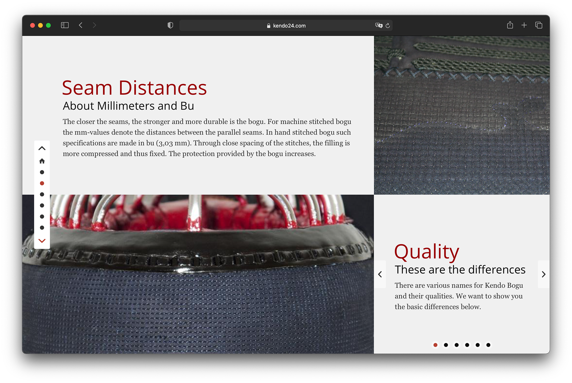
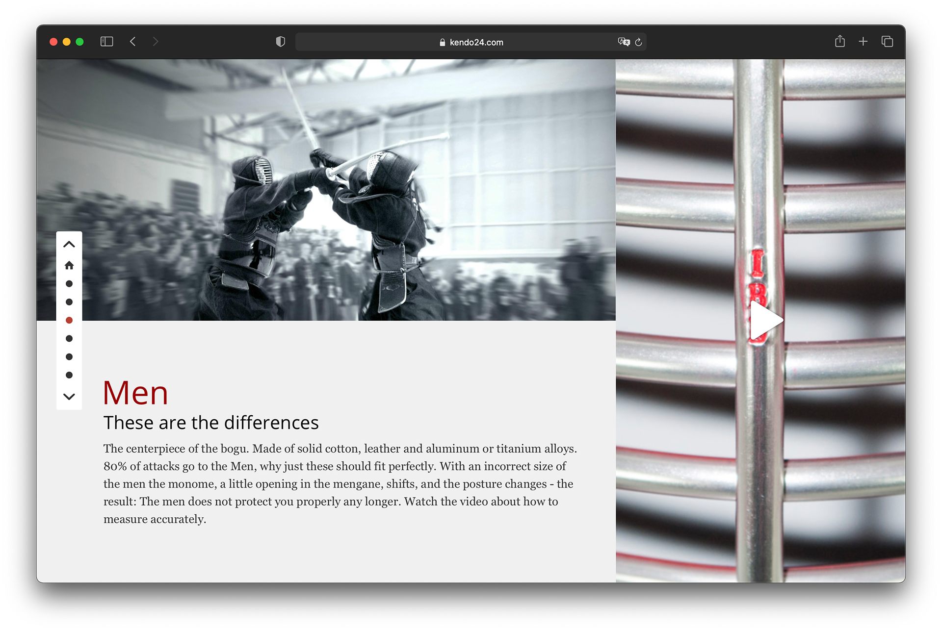
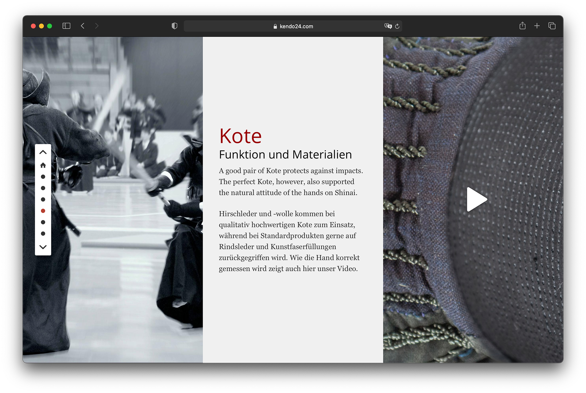
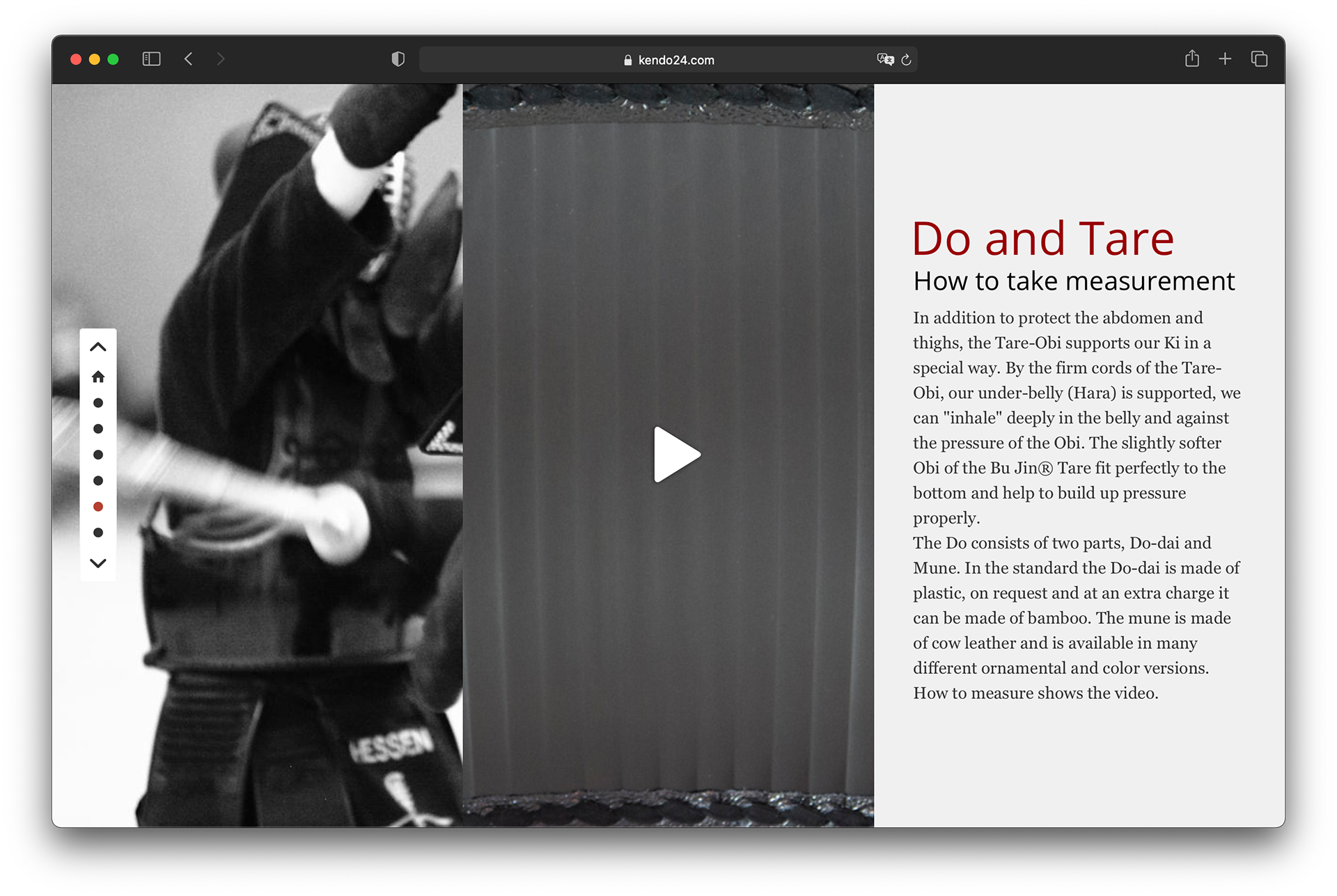
In order to make the oldest Japanese martial art, Kendo, which is not known as a popular sport in the West, more tangible for the customer, a storytelling format was developed in which the individual weapons, clothing and parts of the armour are described. From each individual step of the description, a purchase process for the described product can be started.
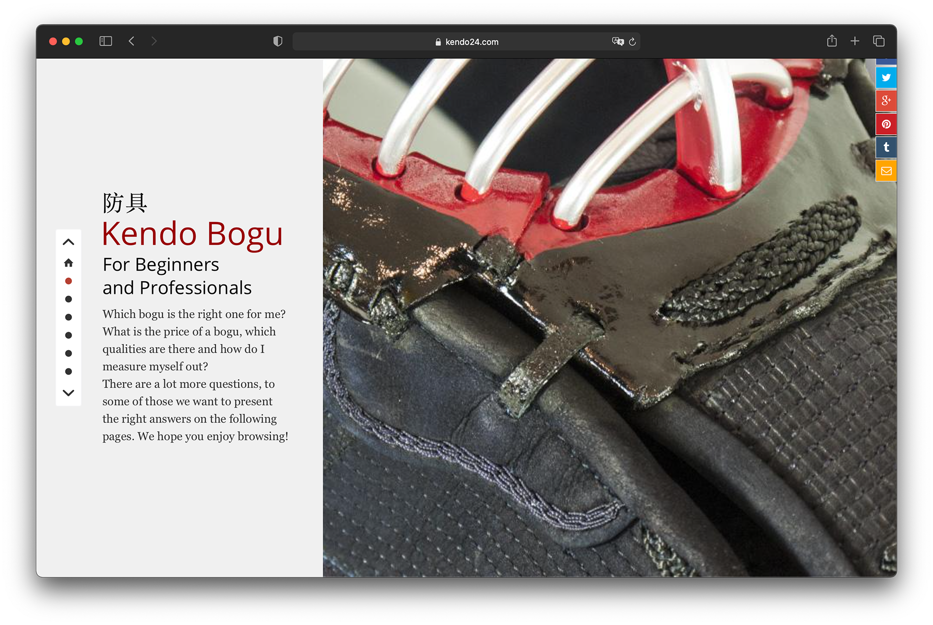
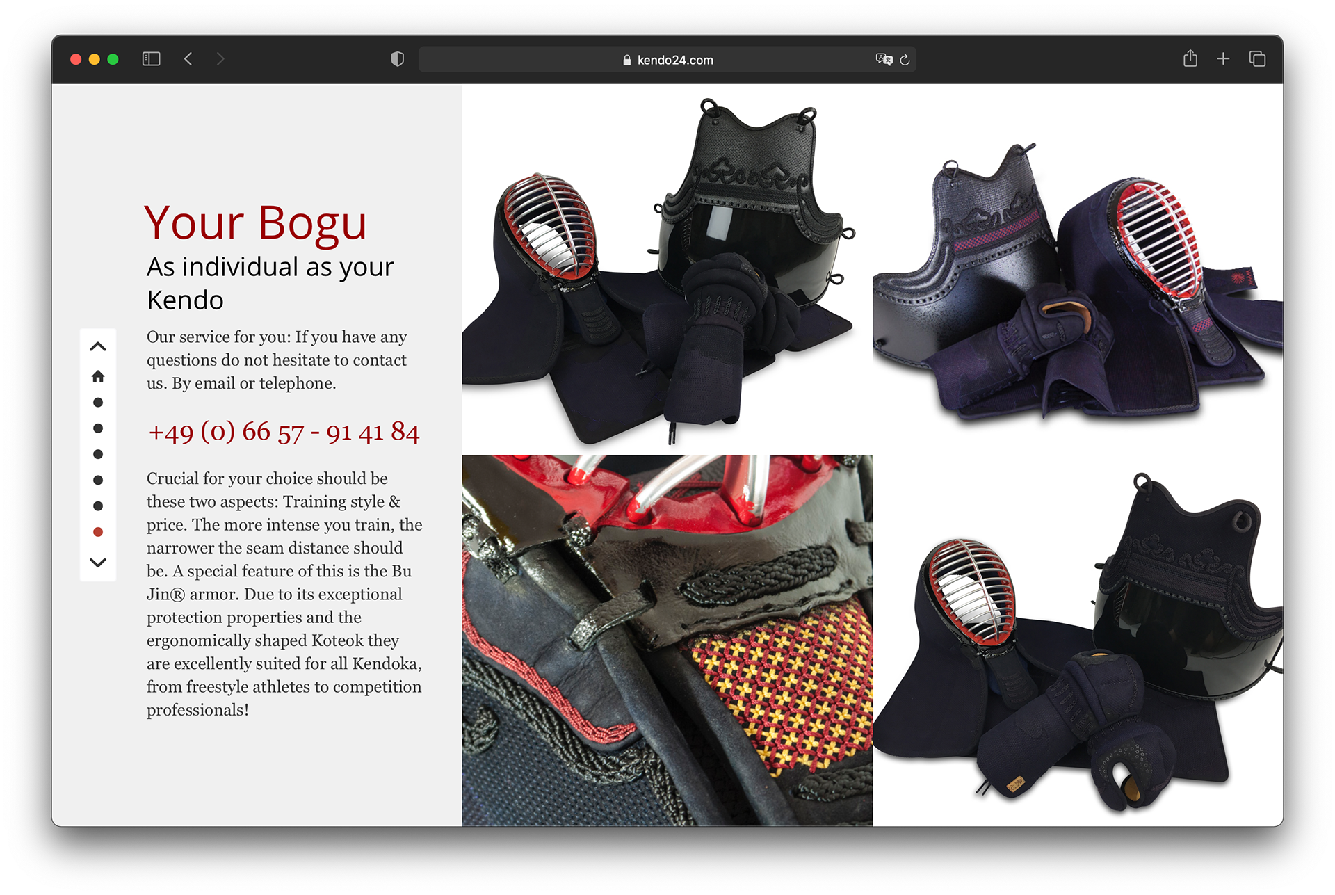
In the background, a new shop system was established and the possibility to order individual custom-made products via the internet was created. This minimised the distances from the order to the supplying companies and significantly reduced the need for warehousing.
Digital First Branding
The full potential and advantages of the restrained digital-first design became apparent when transferred to print advertising, catalogues and brochures. Even as a sew-in for the clothing labels, the logo could be easily adopted by the production machines due to its simplicity.
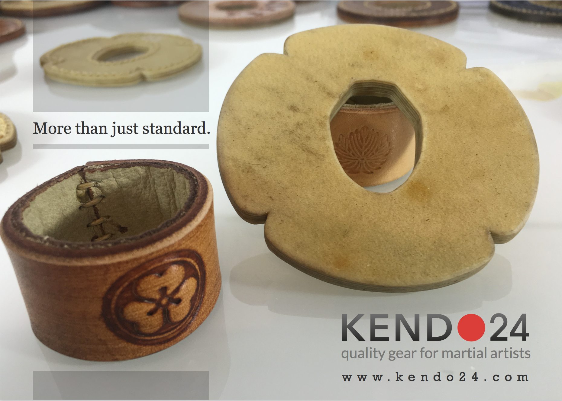
The digital first design as part of the customer experience was later transferred to print materials and sporting articles.
•••